What You Can Do to Raise Our Brand Value (Part 2)
In order to ensure that our brand identity is being communicated properly, please check advertisements and other media for the following six points.
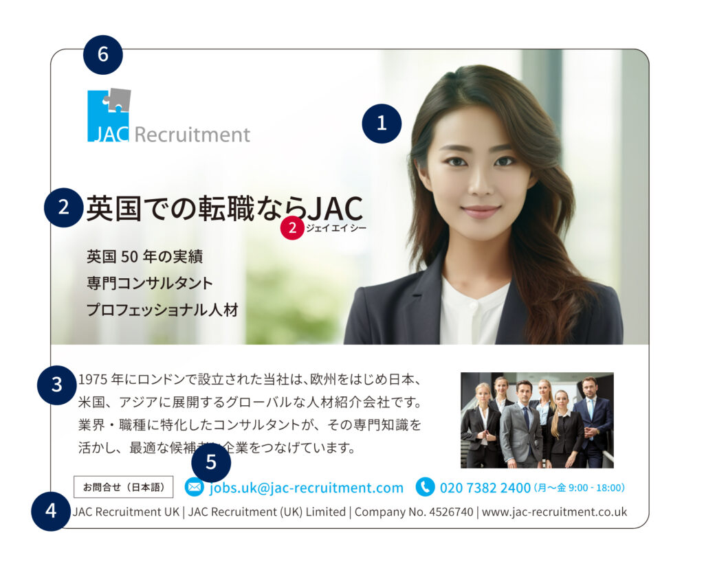
- Main Image
Do the pictures convey an image that is both global and professional? - Catch Copy
Are you certain that the tone of the tagline is not excessively casual?
Is the message conveyed in an accurate and straightforward way?
2_To avoid being mistakenly read as “Jack”, put a kana under “JAC”. The letter “J” used in the catchphrase should be in the typeface Noto Sans JP because it resembles the logotype “J” more than the English typeface “Noto Sans’. - Body Text
Are you certain that the tone of the writing is not excessively casual? Does the written text
accurately convey the value that we provide, and the fact that we are a company that
handlesrecruitment of personnel in the medium- to high-income range? - Footer
Are our company name and the list of group companies displayed in a way that is consistent
with the rules? - Point Colour
Are the things that we want to visually emphasise, such as dates and venues, highlighted
in a vivid colour? Is the colour you are using a stipulated highlight colour? - Overall Composition
Are you confident that the messaging is not cluttered? Leave approximately one quarter of the page blank to reduce the sense of pressure on the reader. Please ensure that both a brand check and a legal review are completed prior to printing or release.
By checking your work against these six points, you can communicate our company’s brand image more effectively.